
Fun with Color! A three part series on making the most of color in your home
Part I – Getting started
With all of the fancy fixtures, finishes and materials to select in a typical home renovation project, the importance of your color palette is often overlooked
The list of decisions and selections to make in a typical home renovation project can seem endless at times. While some of the more expensive elements such as appliances, cabinets, fixtures, and tile may command your attention more than paint, there is perhaps no less expensive way to add character to your home than with a distinctive color palette. Considering that you will be painting regardless, a well-crafted color scheme will lead to a memorable home that reflects the personality of your family without adding to the cost of the project. A thoughtful exterior color palette will improve the curb appeal (and subsequent value) of your home. A rich interior palette will add visual interest to your home, making each space engaging to your family and friends.
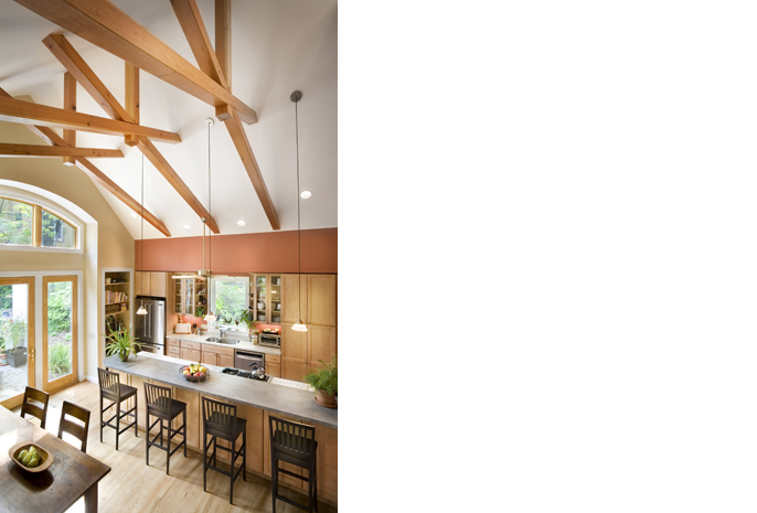
a dramatic color palette adds character to a space without increasing the cost of the project.
Like many interconnecting decisions, getting started can be daunting. The possibilities are literally infinite! Narrow the options by establishing a set of constraints. Start with the big picture: Does the style of your home suggest a particular color palette? Is there a vision or character narrative that limits the color palette to stark whites or warm earth tones? Is there an image in a magazine or on-line you want to emulate?
Next, consider more detailed constraints: Is there a favorite color to build a palette around? Are there any existing finishes or elements to coordinate? Any major pieces of furniture or art work? Will you be using any pre-finished materials (brick, stone, tile, cabinetry) that have a limited range of color choices? In most cases the answer is yes to one or more of these questions. You may find that accommodating those constraints will limit your options considerably, which will help you focus the color palette.
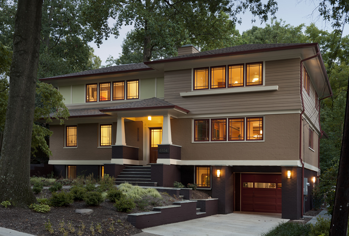
Earth tones were a natural fit for the exterior of this Prairie Style home.
Most paint manufacturers have on-line color selection tools that will suggest colors that pair well with a selected color or tone. This is a great way to begin to build a palette. Benjamin Moore’s website is one of my favorites (http://www.benjaminmoore.com/en-us/for-your-home/color-gallery#&ce_vm=0). You can search through all of their colors, or you can limit yourself to one of several color lines or families. You can select a color and it will offer other colors to pair with it, and suggest similar colors to consider instead. In some cases, switching to one of the similar colors will dramatically change the color palette. When working with prefinished materials, I sometimes start by picking a color that looks similar to the material I am working with, and then see what kind of palette it builds around that.
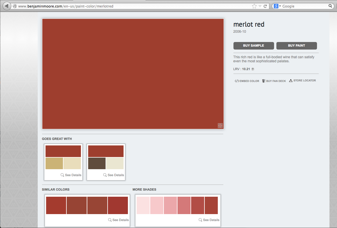
On-line color selection tools are a great place to start narrowing color choices.
You can also go to a local paint store and peruse their color displays. Most will have several suggested color palettes you can use as inspiration as you begin to build your color palette. Since most paint manufacturers can match colors from just about any source, you are also not limited to the paint chips you see on-line, or in the display. You can build a color scheme from a piece of art, furniture, pottery…. the possibilities abound!
While on-line tools and paint chips are a great way to get started, final color selections should never be made based on a computer screen. To get a true sense of the color, you will need to paint samples on your walls. The context of the surface in question, the nature of the material, access to natural daylight, and adjacent colors will all impact how the finished product will look.
Specific placement of paint samples is critical in ensuring you get the information you need to make a good decision. Place exterior samples in locations that get natural light and shade, so you can see how your colors work in both settings. When testing a multi-colored scheme, locate samples immediately adjacent to one another. Having an intruding color between (that will not be in the ultimate color palette) will prevent you from understanding how the colors interact with one another. Finally, as you consider the samples, be sure to have other primary materials on hand, such as roof shingles, tile, carpet samples, etc.

Looking at color chips and on-line color coordination tools is a great place to start, but nothing tells you more than actual samples on the walls.
While there are some rules to color coordination, they are loose and often meant to be broken. It’s true you may want to stick to either warm tones or a cool palette, but given the variety of finishes your home will have, it is likely you will find yourself leaving the comfort of your color wheel behind at some point in the process. Think about the style of your home and what colors will reinforce that character narrative the most. Most of all- have fun with it!
– Shawn Buehler, Principal